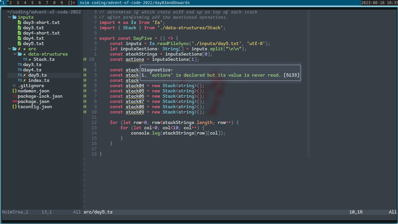
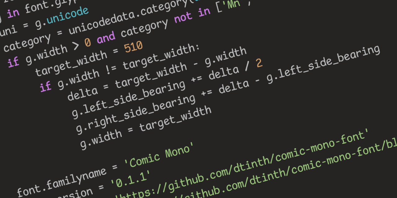
Seriously, though, Comic Sans was originally designed to be legible at the smallest possible font size, and the lack of hard lines makes it easier to read!
I…don’t hate it? Why am I not horribly offended by this?
I feel the same way. I hate that Iike it and am now going to try it.
Friendship ended with font gatekeeping and dogpiling, accessibility is my new best friend
Oh no, I was ready to pick up my pitchfork, but that is super legible. Brb, I need to go take a look at myself in the mirror…
WolfgangsChannel also recently said he used a comics sans-lile font
⚠️ I have reported this post to the proper authorities.
Title is misleading, it’s a monospaced derivative of Comic Sans that’s actually nice, not actual Conic Sans.
Conic Sans is the hyperbolic version of Comic Sans
I miss RES’s context feature now. Thank god this thread wasn’t too long, so I was able to find my comment you replied to in it in a reasonable amount of time.
Does it support ligatures??
I was addicted to coding with Comic Mono and ended up purchasing Comic Code. No regrets.
I mean Comic Mono is mentally relaxing and legible so great font of choice
Look what you have done! I used Operator Mono for Italics. I kind of like this!

bro… how did you manage to stain a screenshot
Is it that bad? Now I have IBM Plex installed


